Hi!
This is the last newsletter of 2023, and I wanted to start with a big thank you. Not only have I really enjoyed sending these newsletters, but the response to this new style has been very positive, so I certainly hope to continue sending out emails like this in 2024 (with image critiques, edits, conversations about photography, and lots more!).
In today's newsletter, I share:
- The bi-weekly photo challenge
- Three photography lessons that I learned in 2023
- A couple more image critiques
But before I get started, since it is the end of the year, I wanted to ask you another question:
What are your photographic goals for 2024? For instance, do you plan to learn new post-processing skills? Develop your ability to capture a certain type of subject? Spend more time mastering your camera settings?
I'd love to hear from you, so if you're interested in sharing, hit Reply and let me know!
The dPS Bi-Weekly Photo Challenge: Christmas
From Sime:
So, this is Christmas... (And I wasn't even listening to John Lennon!)
Naturally we'll try 'Christmas' as a theme for the next couple of weeks, that said, Christmas is something different, or even nothing at all to some people, so for those that don't want to participate in this theme, we welcome you to share a photograph that means something to you.
Make sure you include the hashtags #dPSWeeklyChallenge and #dPSGardens in your post, in the comments of our official weekly challenge page, or over on social media. You can tag us on Facebook, Instagram, or Twitter!
And you can also share your image(s) in the dPS Facebook group!
3 Photography Lessons I Learned in 2023
Normally, I like to focus this newsletter on your photography rather than mine. However, I've been reflecting on key photographic lessons I've learned (or further cemented) over the last year, and it occurred to me that you might find them useful!
Of course, not all of these lessons will apply to everyone, so if you don't find them useful, that's okay!
Without further ado, here are three photography lessons to keep in mind as you photograph in the new year:
Nothing beats time spent behind the camera. This past year, my photography schedule was pretty inconsistent. Some months, I photographed for dozens of hours; other months, I barely picked up my camera at all. During those "off" months, I still thought about photography, came up with new ideas and techniques to try, read about photographic practice, looked at inspirational photos, etc.
But if I compare those periods - the months I was photographing regularly versus the months I spent inside - it was when I spent consistent time behind the camera that I grew more rapidly as a photographer. I honed new skills, I created work that I liked, and I came up with fresh ideas that made me excited to keep shooting.
Now, you can absolutely grow as a photographer by looking at photos captured by others, by reading articles, by watching instructional courses, and so on - but for the fastest improvement, I think it's extremely important to combine instruction with hands-on practice.
There is no such thing as bad light. Photographers love to talk about "good" light and "bad" light, and how you should always strive to shoot when the light is "good" (generally during the golden hours) and avoid photographing when the light is "bad" (generally during midday).
There's some truth to this - for instance, what's often identified as "good" lighting makes it easier to produce more romantic, colorful images - but over the past year, I pushed myself to shoot in all sorts of lighting: harsh midday light, soft golden-hour light, ethereal blue-hour light, flat cloudy light, and more.
And I found that, with the right approach, it's possible to create images that I was pleased with in basically any light. I just had to observe the light and work with its effects until I got what I wanted! Bottom line: Light certainly makes a huge difference, but if you can learn to work with the light as it is, you can get great shots regardless.
Immediate photo review can help you improve. This past year, I made much more of an effort to look at my photos soon after I had taken them, and it made such a difference. I was able to remember exactly what I was thinking when I took each photo, the techniques I had used, and my goals. Then, when reviewing the shots, I was able to learn a lot more from the files because I could think about what I had done well or poorly at the moment of capture, as well as what I needed to change next time.
(As an aside, I also found it helpful to take notes as I reviewed my photos and reread them periodically - that way, I was able to remember key insights more consistently and apply them to each new photoshoot.)
Critiquing Your Photos
I have a couple more image critiques to share - thanks so much to everyone who has sent in photos, and I encourage you to send in more (as always, you can just hit Reply to this email and attach a file!).
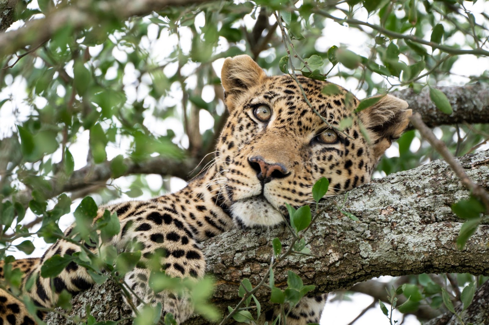
First, we have a stunning leopard image from Scott:

This is wonderful, Scott - love how you've used a telephoto lens to create that frame-filling composition - it really allows the viewer to appreciate the details on the leopard's face, including those wondrous eyes. I also like how you've positioned the leopard's head off-center but still included plenty of room for the subject to "breathe," both of which make for a more compelling composition. And the green leaves, with the beautiful out-of-focus leaves in the background, do a great job of framing the leopard and guiding the viewer's eye to the main subject.
Two small ideas for improvement:
- While I love the green frame, there are a few points where the overlap between the leaves and the leopard's head is slightly distracting. Specifically, the twig over the eyelid, the out-of-focus branch that just overlaps with the ear on the right, and the small branch that intersects with the mouth are drawing my eye, and if there were a way to adjust your angle so you could shoot without those branches, that would be just outstanding. Of course, with situations like this, there's often little you can do, but it's something to bear in mind for the future.
- While it's not super visible in the small version, when viewing the image on a large monitor, I'm seeing what appears to be a slight amount of motion blur on the leopard's face. The EXIF data indicates that your shutter speed was 1/20s, which is quite slow, especially when shooting with a telephoto lens (in fact, I'm impressed that you managed to get the image as sharp as you did!), and so even a small amount of movement from the leopard would have caused blur. My recommendation in such scenarios would be to increase your shutter speed while also boosting your ISO; that way, you can avoid motion blur as well as blur due to camera shake, and you can also keep the exposure consistent. )Increasing the ISO will also contribute noise to the image, but I'm seeing very little noise in the existing file, so I think you could definitely push the ISO a lot higher without significant image degradation.)
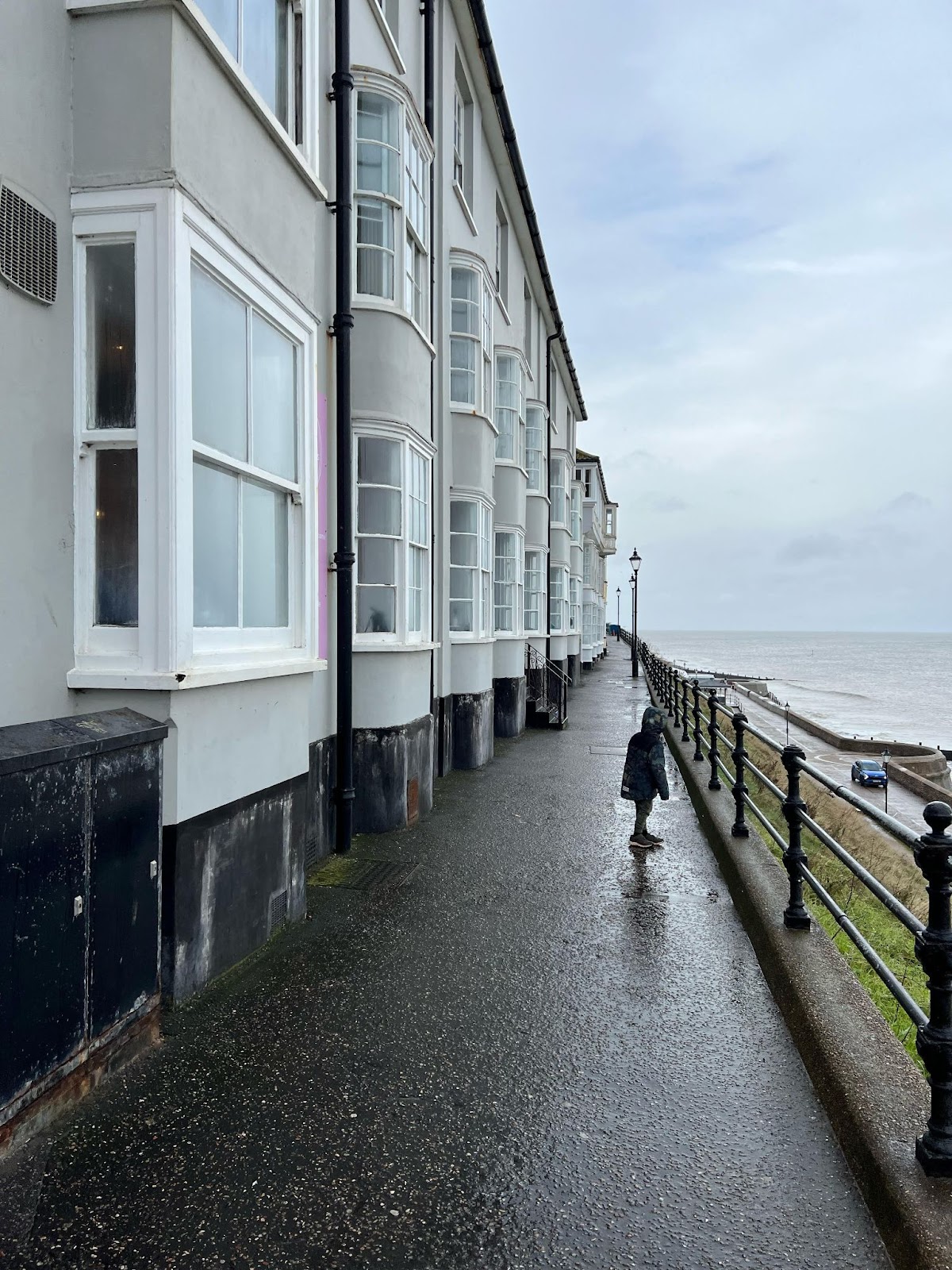
Second, we have a beautiful urban landscape from Wouter K:

Such an intriguing shot, Wouter! I love the vanishing point in the distance, and the way the path both leads the eye and creates depth within the frame. You've also done a wonderful job of exposing for both the details in the dark parts of the buildings as well as the bright parts of the sky. And the scene is just very cool, with the rows of windows on the left and the moody horizon on the right.
A few thoughts to make the image even better:
- While I like the inclusion of the child, I wish there were a bit more separation between their head and the strip of concrete on the right; at the moment, that intersection point is creating a spot of confusion in the image (at least to my eye!). If the child had taken just a few steps toward the camera, then you could gain a bit of space, and the image would be just a touch more straightforward.
- There seems to be a lot going on along the right-hand side of the shot; the image edge intersects with that black railing, plus there's a car in the distance as well as that half-circle concrete structure. All of this draws the eye and clashes with the lovely sense of peacefulness created by the other two-thirds of the shot, so I'd recommend changing the composition in pursuit of greater simplicity. For instance, by taking a few steps back and/or turning slightly toward the railing, you could perhaps include a bit more negative space on the right. You could also wait for the car to move out of the frame - while I do sometimes like cars in urban landscape photos, I think it's more of a distraction in this shot.
Well, that's all for now - thanks again to Scott and Wouter for sending in their excellent images!
Wishing you a great end to 2023 and a great start to 2024!
Jaymes Dempsey and the dPS team
ConversionConversion EmoticonEmoticon