Hi!
Hope you're having a great start to December! Here in Michigan, we had our first snowfall, so I took the opportunity to get out with my camera and capture a few photos.
(It's always tough to photograph when the snow - or rain - is pouring down, but the resulting photos are often worth the discomfort!)
Anyway, in today's newsletter, I'll share:
- The bi-weekly challenge
- More photo critiques!
But before we get started, I have a question for you:
Would you like me to edit an image of yours? And then share the final image - along with the editing approach I used - in next week's newsletter?
If that's of interest, please reply to this email with one (or more) unedited image files. Ideally, the images should be full-size RAW files, though original JPEGs are fine, too.
And if enough people are interested, I'll go ahead and share some image edits next Saturday!
From Sime: If you celebrate Thanksgiving, this challenge is for you. If you don't celebrate Thanksgiving, this challenge is for you! (You can be thankful for that)
You can share a photo, or up to five photos as a series of how your Thanksgiving went, or, you can share a photo or a series of five photographs of something you've been thankful for in the last year.
Make sure you include the hashtags #dPSWeeklyChallenge and #dPSThanksGiving in your post, in the comments of our official weekly challenge page, or over on social media. You can tag us on Facebook, Instagram, or Twitter!
And you can also share your image(s) in the dPS Facebook group!
Critiquing your images
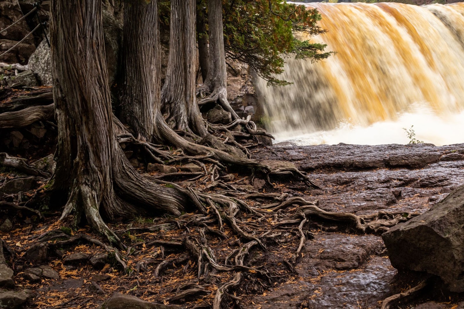
Once again, people seem to really enjoy reading critiques of subscribers' images - so this week, I'm critiquing a few more (beautiful!) images sent in by dPS community members, starting with a gorgeous long-exposure shot from Vicky R:

Thanks so much for sending this one in, Vicky - what a tremendous image! I love the rhythm created by the trees (they look like they're waiting in line!), and I appreciate how you've used a longer shutter speed to blur the water but didn't go so long that you lost most of the texture.
I'm also a fan of the beautiful contrast between the dark foreground elements and the bright water in the background. And the tighter composition lends a sense of intimacy that's lovely (and works especially well with forest scenes, at least in my experience!).
A few recommendations:
First, as I mentioned above, I love the sense of intimacy, and I would lean into that even further. By taking a few steps forward and framing more tightly, you could hone in on the tree trunks, the winding roots, the green leaves, and the water - and exclude some of the elements around the edges of the frame that are slightly distracting, like the rock on the right-hand side, as well as the ropes in the upper left-hand corner.
(You could also try cropping in to achieve the same effect.)
A tighter frame would also remove that sliver of space just above the waterfall; for me, that detracts slightly from the sense of intimacy, and it also adds some tension.
Second, the foreground is looking a little dark on my monitor, so I'd recommend boosting the shadows in an editing program to recover a bit of that shadow detail. (You could also decrease the highlights slightly to bring back a little texture in the whitest parts of the water.) I wouldn't do a lot - as I said, I like the contrast! - but a little could make a big difference, I think.
Thanks again for sending along such a lovely shot, Vicky!
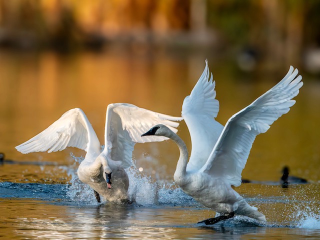
Next, we have an action-packed trumpeter swan image from Henry D:

First of all, Henry, I love trumpeter swans, and I've spent quite a few hours photographing them, myself, so I appreciate you sending this one in.
Second, there are a lot of great things going on in this image: the wonderful golden-hour light, the way you've used a fast shutter speed to capture the intense movement, and the lovely background (which combines smooth blur with those amazing colors!).
A few minor suggestions:
- When photographing two birds at once, I recommend capturing a moment that establishes a visual relationship between the two birds. Right now, the birds feel somewhat disconnected to me - one is flying to the left, while the other is flying toward the viewer. The image is very nice as it is, but if the birds were interacting more closely, or even if they were both flying in the same direction, I think it could be even more impactful.
- The bottom of the image feels a little cramped; whenever possible, I recommend leaving some space for the birds' feet to "breathe" a little. (It can also be helpful to think about balancing out the opposite side of the frame - so if you have a lot of empty space at the top of the image, as you do here, it's often effective to include a decent amount of empty space at the bottom.)
- The ducks behind the swans are a subtle distraction - if you wanted to, you could clone them out (though some bird photographers don't like to clone, which I completely understand).
Regardless, it's a beautiful image, Henry, and if you have any more trumpeter swan photos, I'd love to see them.
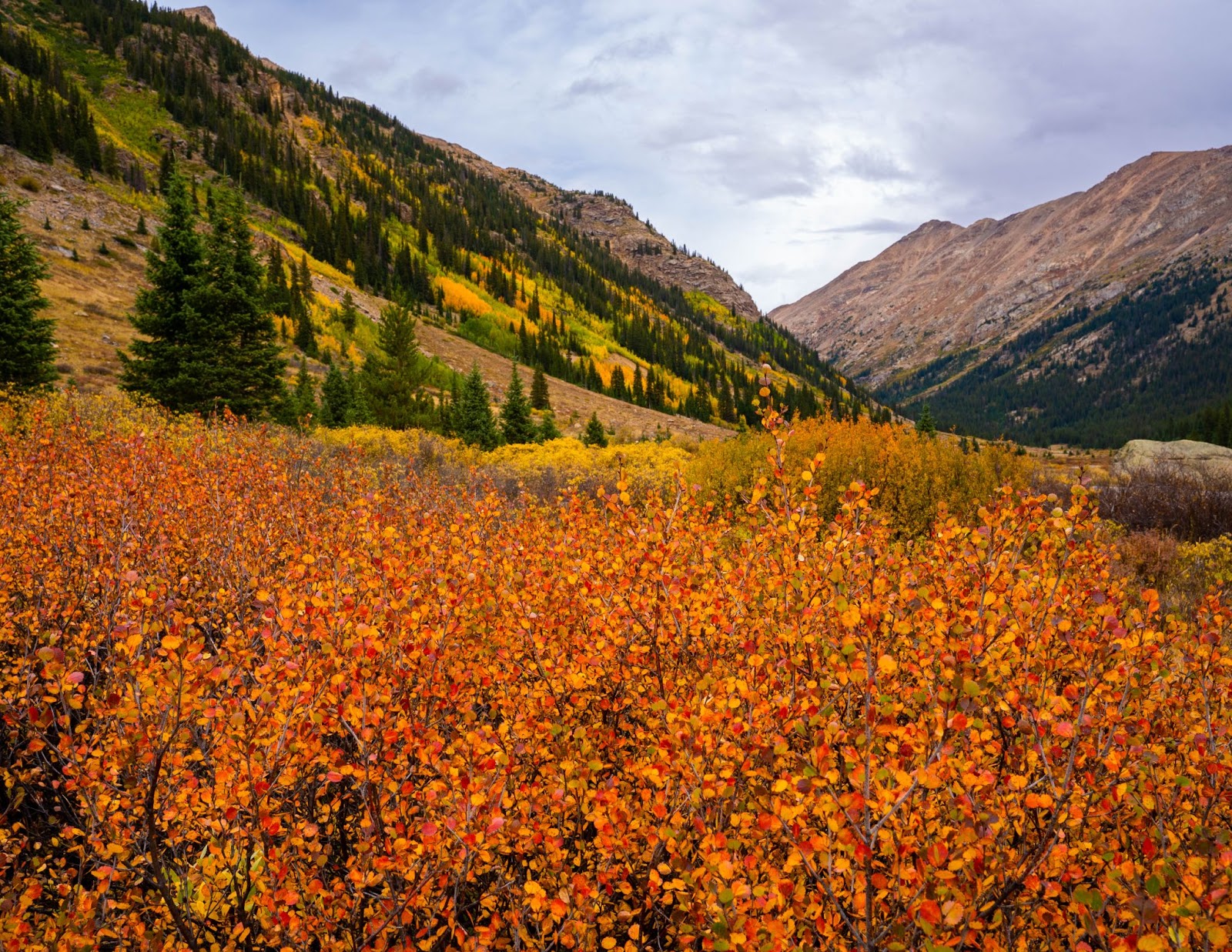
Finally, we have a stunning autumn landscape image from William H:

Such gorgeous colors, William! Those foreground leaves are absolutely magnificent! And I love the layered composition, with bands of vegetation stretching across the scene.
I'm also a huge fan of the incredible texture created by the leaves and branches in the foreground, and how you've chosen to frame the scene so tightly.
A few thoughts:
First, I'm noticing that while the foreground is tack-sharp, the background is relatively soft. I do think that complete sharpness throughout the scene could add some impact, though achieving enough depth of field to give you that level of sharpness is certainly a technical challenge for a shot like this! Since your foreground subject is so close to the lens, even with a fairly small aperture, the window of sharpness will be pretty narrow.
One approach you could take is adjusting your point of focus. By manually focusing a bit farther back in the scene, you might be able to increase the overall sharpness.
Another approach would be to use focus stacking, where you capture several shots with different points of focus, and then blend them together - using Photoshop - to create an image that's sharp throughout. Focus stacking doesn't always work, and depending on the depth of field you achieve in each individual file, you may struggle to get all of the overlapping elements to look realistic - but it could be worth a shot!
Second, while I love the overall composition, that light-colored rock on the right-hand side draws my eye away from the main scene. In general, I recommend ensuring that each and every element adds to the shot - and if it doesn't add to it, exclude it! In this case, the rock is a very minor distraction, and the shot still looks great, but you could always use an adjustment brush to darken it down so it blends in more.
Thanks for sending the image, William - it's really, really beautiful.
Well, that's all for now!
And remember, if you would be interested in having an image of yours edited, please send the RAW file (or the original JPEG) in a reply to this email.
Talk to you next week!
Jaymes Dempsey (and the dPS team)
ConversionConversion EmoticonEmoticon