Quick tips to improve your compositions
To capture great photos, it's important to understand camera settings, it's important to understand lighting, but it's also important to understand composition (i.e., the way you arrange different elements within the frame).
Composition is often neglected by photographers, but here's the deal: By mastering composition, you can affect your images in a variety of different ways. Here's what careful use of composition can do for your photos:
- Give a sense of balance
- Give a sense of order
- Give a sense of movement
- Create different moods
- Give the illusion of depth
- Create a relationship between different objects
So let me offer a few handy tips to enhance your compositions and take your photos to the next level:
- Start by identifying your main subject. Most images include a main subject - the thing that you want to emphasize most in your photo, the thing that drew you to the scene in the first place. As you frame up your shot, it can be helpful to consciously identify the main subject and think about how you can best position it in the frame to achieve the effect you're after. That way, the main subject can act as a sort of anchor, and you won't feel overwhelmed by the need to create a composition using all the different objects in the scene at once.
- Don't neglect the rule of thirds. If you've been doing photography for a while now, you've probably come across the rule of thirds, which encourages you to position key elements a third of the way into the frame (either vertically or horizontally). And while the rule of thirds might seem like a bit of a visual cliche, it really can be helpful, especially when you're just starting out with composition. If you're capturing a stunning vista, for instance, placing the horizon a third of the way into the frame can make a huge difference! (For more on the rule of thirds, see our in-depth article here.)
- Use foreground elements to create depth. Looking to create the illusion of depth in your images, so the viewer feels like they can literally step right into the scene? Here's a handy trick: just make sure that you include both distant background elements and a near foreground element or two. For instance, you might include mountains in the background and a few boulders in the foreground! The foreground elements and background elements will work together to create that sense of deep space, and the result will be breathtaking!
- Consider composing on a tripod. I get it: Tripods are clunky and cumbersome to carry. But in my experience, the act of putting your camera on a tripod really forces you to think about all the different elements in your photo and, as a result, causes you to frame and order your images intentionally. For that reason, I use a tripod as much as possible. And if you're looking to improve your compositional skills, I encourage you to do the same.
- Don't be afraid to try different compositions. A big part of composition, for beginners and for pros, is experimentation. Even a slight change of camera position or angle can dramatically impact the resulting image, and while you'll get better at visualizing these different effects over time, it's always helpful to just test out different ideas. Move your camera left and right, try different angles, take steps forward and backward - have fun, and see what you can create. (One additional tip here: When experimenting with different compositions, I recommend looking through your camera's viewfinder whenever possible. It's a great way to hone in on little details and recognize how small changes can make a big difference!)
Critiquing your photos
Once again, I have additional critiques to share with you! Thanks to everyone who submitted images (and, as usual, if you want to submit your images for critique, go ahead and hit Reply to this message and send over the file!).
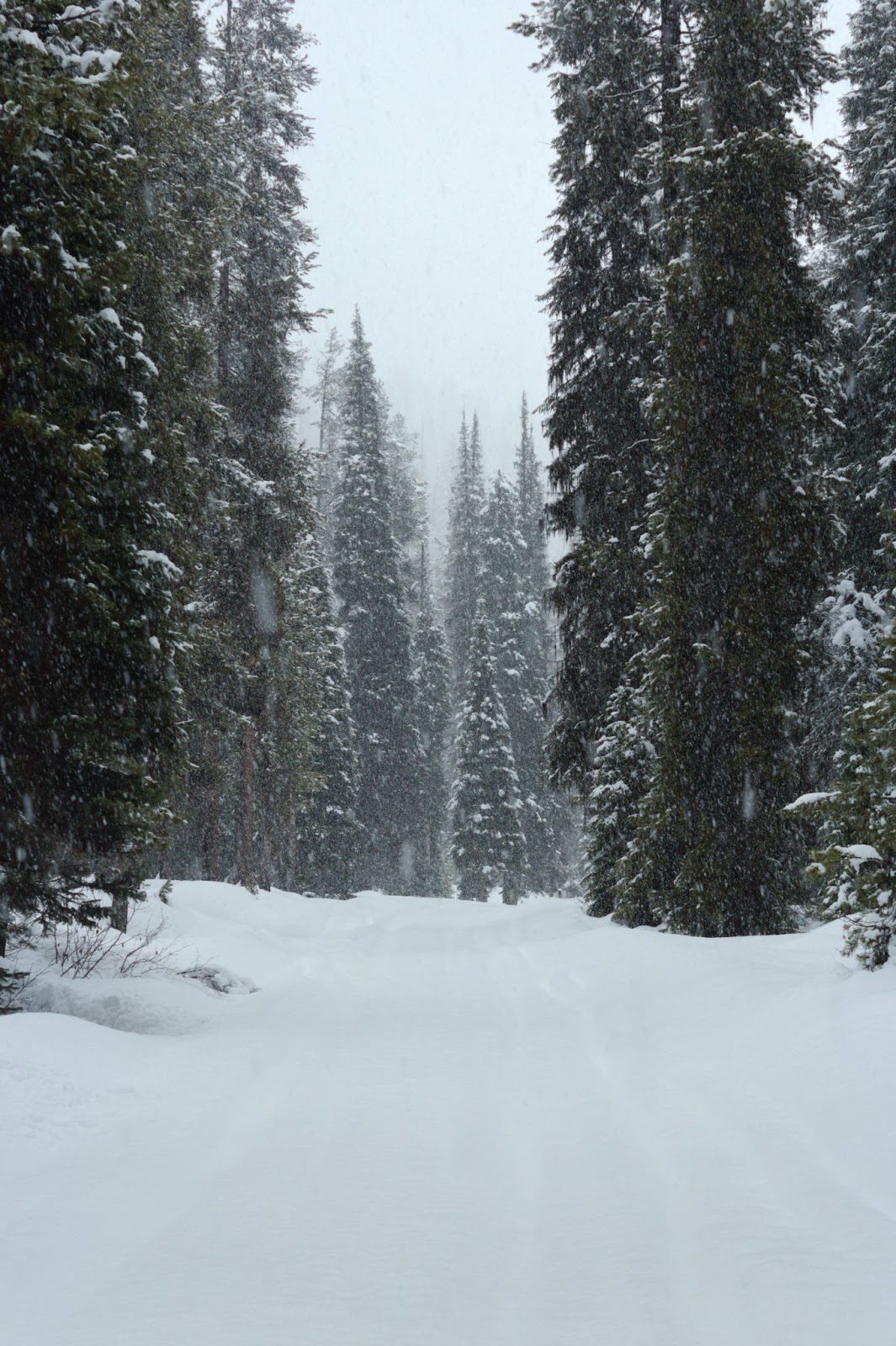
First, a lovely snowscape from Ashley S:

I'm loving the atmosphere you've captured here, Ashley - there's a great sense of mood thanks to the fog, the dreary light, and the falling snow. I also like how you've composed so that the nearer trees frame the more distant ones, and it's great to see one clear but subtle focal point that my eye can rest on: that small pine tree toward which the path seems to lead.
A few small suggestions for improvement:
- I'm noticing a lot of empty space toward the bottom of the frame, especially because all that white snow seems fairly flat (at least on my monitor). I'd recommend cropping in from the bottom in order to better emphasize that grove of trees in the distance.
- The falling snow is great, but there are a few spots where the snowflakes seem to smear across the trees and take away from the naturalness of the scene you've captured. I'd recommend cloning these out if possible. One trick here is to capture multiple images from a tripod of the same scene - then you can align the images in post-processing and pull from the different images in order to get rid of any problematic snowflakes! (This also works when photographing rain, by the way!)
- I'd encourage you to work with this image a bit more during post-processing to emphasize the darker, moodier feel of the scene - for instance, you could try to bring back more texture into the snow and the sky, and you might consider adding a subtle vignette to push the viewer's eye toward the more distant trees. (I'd also try converting the image to black and white to see what you think - I personally like to shoot landscapes in color, but for graphic scenes like this, with the extreme dark and light tones, you can get great results with a B&W conversion!)
Overall, though, you've captured a gorgeous image, Ashley, so thanks so much for sending it in!
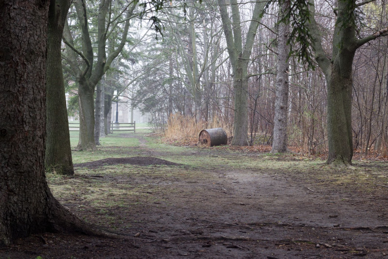
And second, a beautiful forest scene from Raymond N:

I love photographing in fog, Raymond - the tough part is managing convey that sense of atmosphere through your image, and I think you've done a great job here. I like how you've created plenty of depth by including both near foreground and distant background details, and you've done a nice job of rendering the sky where it peeks through the trees. I like how the path subtly leads the eye from the foreground to the background, too.
In terms of ideas for improvement, my primary focus would be on framing. You've done an excellent job of ensuring plenty of depth and dynamism, both through foreground-background interplay and the leading lines of the path. But I think you could improve the image even further by aiming for a stronger sense of balance across the scene; right now, the image feels weightier on the left-hand side due to those dark trees and distant break in the trees, while the right-hand side feels more empty.
If you were to step forward a bit, you could potentially exclude the nearest tree on the left so that the next set of trees balanced each other more effectively across the frame. (You would also eliminate the slight overlap between the first and second tree on the left, which subtly draws the eye.) You might also consider moving slightly to the right and composing so that the distant gap in the trees is more centered in the frame - that way, you could create a stronger sense of symmetry, which often works well when elements move toward a vanishing point in the distance.
One more recommendation: It looks like the foreground is a little soft, but you could achieve front-to-back sharpness by making sure your lens is stopped down to a narrow aperture and ensuring that you focus around a third of the way into the frame (roughly at the hyperfocal distance). That way, the viewer can fully appreciate the gorgeous scene that you've captured!
All that said, I'm really liking what you've created, Raymond, and with a few minor adjustments, I think this shot could be absolutely outstanding!
That's all for now, but thanks again to everyone who submitted photos - it's always great to see work from the dPS community, and don't hesitate to submit images for next week's critique!
Talk to you next Saturday,
Jaymes Dempsey and the dPS team
ConversionConversion EmoticonEmoticon