Hi!
First of all, I want to thank everyone who replied to my question in the previous newsletter - the response was overwhelmingly positive, so sometime soon, I'll do my best to provide recommendations for creating a website to display your images!
Today, I have a couple of items to share with you:
- Two photographers whose work you might appreciate
- Two more critiques!
So without further ado, let's dive right in, starting with:
Two photographers to inspire you
It's been a while since I recommended photographers whose work you might find inspirational - so today I have two more people for you to check out!
First, Guy Tal. Tal is one of my absolute favorite contemporary landscape/nature photographers, and here's why: Instead of capturing dramatic skies and wide-angle vistas, he carefully records the subtle beauty of the landscape. Tal's images are both intimate and contemplative, and if you haven't yet had a chance, I encourage you to spend some time perusing his portfolios (his Recent Work page is a good starting point).
Second, Stephen Shore. Shore looms large in the history of photography; at the age of 14, he sold his first photographs to the Museum of Modern Art; at the age of 24, he was the first living photographer to have a solo show at the Metropolitan Museum of Art; and his 1970s road-trip images, captured while crisscrossing the US with a large-format film camera, massively influenced later generations of photographers - for their use of color, for their focus on the everyday American landscape, and for their masterful approach to composition.
That said - as is often true of fine-art photography! - viewers of Shore's work tend to fall into two separate camps. One camp believes that Shore is an absolute genius, while the other camp believes that Shore's work is just plain boring. Of course, it's also possible for both to be true at the same time - I'm very much in the "absolute genius" camp, but I can certainly understand why many folks find his photos uninteresting.
Anyway, give his work a look and see what you think! I'd recommend starting with his Uncommon Places project, which has the broadest appeal (it's the 1970s road-trip series I mentioned above). And if you're still interested, follow it up with the American Surfaces portfolio, which features a lot of the same subjects but was captured in a deliberately nonchalant, snapshot-like style.
Photo critiques!
This week, I have two more critiques to share - and, as always, thank you to everyone who sent in images!
(For those of you who would like to see your images critiqued in a future newsletter, feel free to hit Reply to this message and send along a file or two! Just make sure you mention that the images are indeed for critique in the email body or subject line, and please make sure the files are JPEGs and at least 1000 pixels on the long end!)
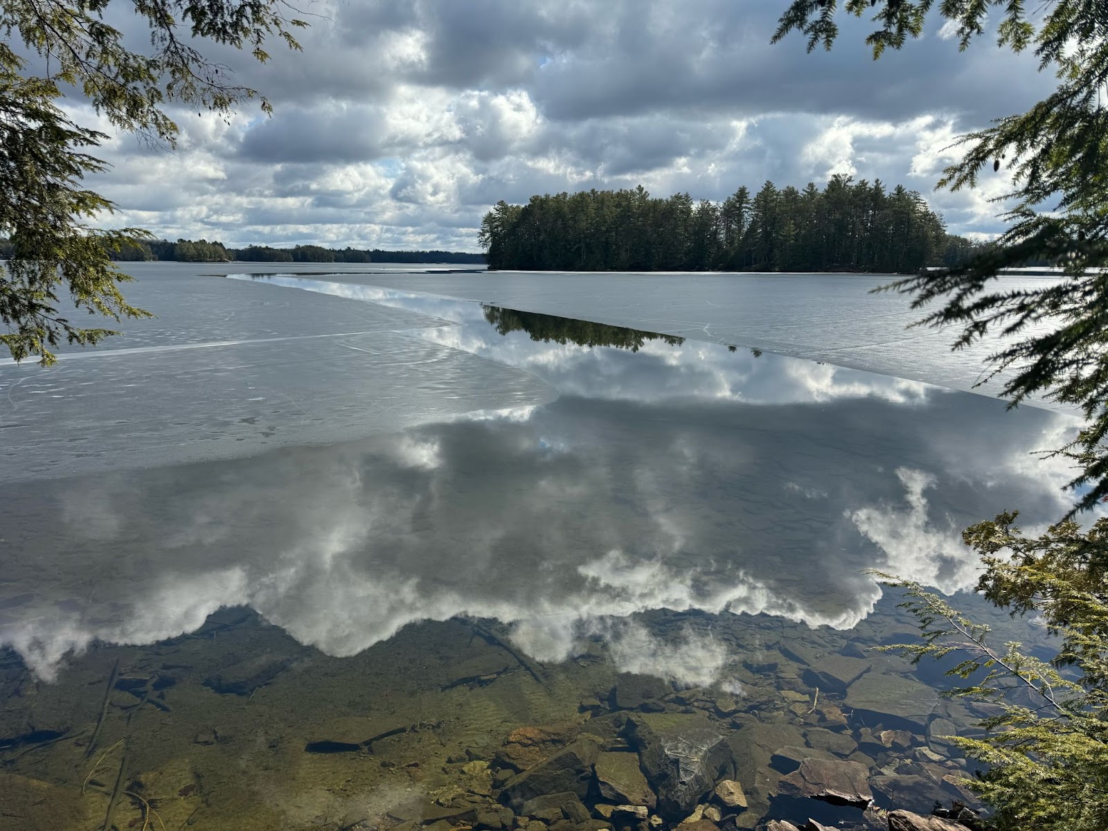
First, we have a lovely landscape from Dave:

What I like:
- You've captured such a nice scene, Dave, with that combination of the ice and the channel water cutting through the center. The intense clouds and the cloud reflections also add some interesting drama to the shot.
- I like how you've combined foreground elements (the branches around the edges, the rocks), midground elements (the ice, the channel of water), and background elements (the moody clouds, the stand of conifers). As a result, the image has a nice sense of depth, and the viewer's eye can move through the scene and engage with each portion of your composition.
- The framing effect - with the branches jutting out at the edge of the scene - is neat!
What could be improved:
- While I do like the light as it is, I suspect that the drama at sunrise/sunset would be even more eye-catching! If this was taken in the afternoon, I would be interested to see how the shot might look if you waited a little longer; assuming the sky didn't turn completely overcast, those clouds would likely result in a spectacular sunset!
- Compositionally, I wish there were a bit more space to show off both the stand of trees and the line created by the water/ice. The framing effect created by the foreground branches is great, but it also restricts visibility in the background. Ideally, the foreground branches wouldn't overlap with the right-hand edge of the distant trees - if you were to move slightly forward and to the left, you might be able to keep everything else intact while preventing that overlap. (Relatedly, I'd encourage you to see if you can gain a bit more symmetry with the foreground branches - if you could adjust your camera to include branches in the bottom left-hand corner, then the frame would feel more balanced!)
- I'd also consider darkening down the foreground in post-processing to help emphasize the more distant trees. Right now, the rocks and water are relatively bright, and by darkening that area, you can ensure the eye moves more smoothly from foreground to background.
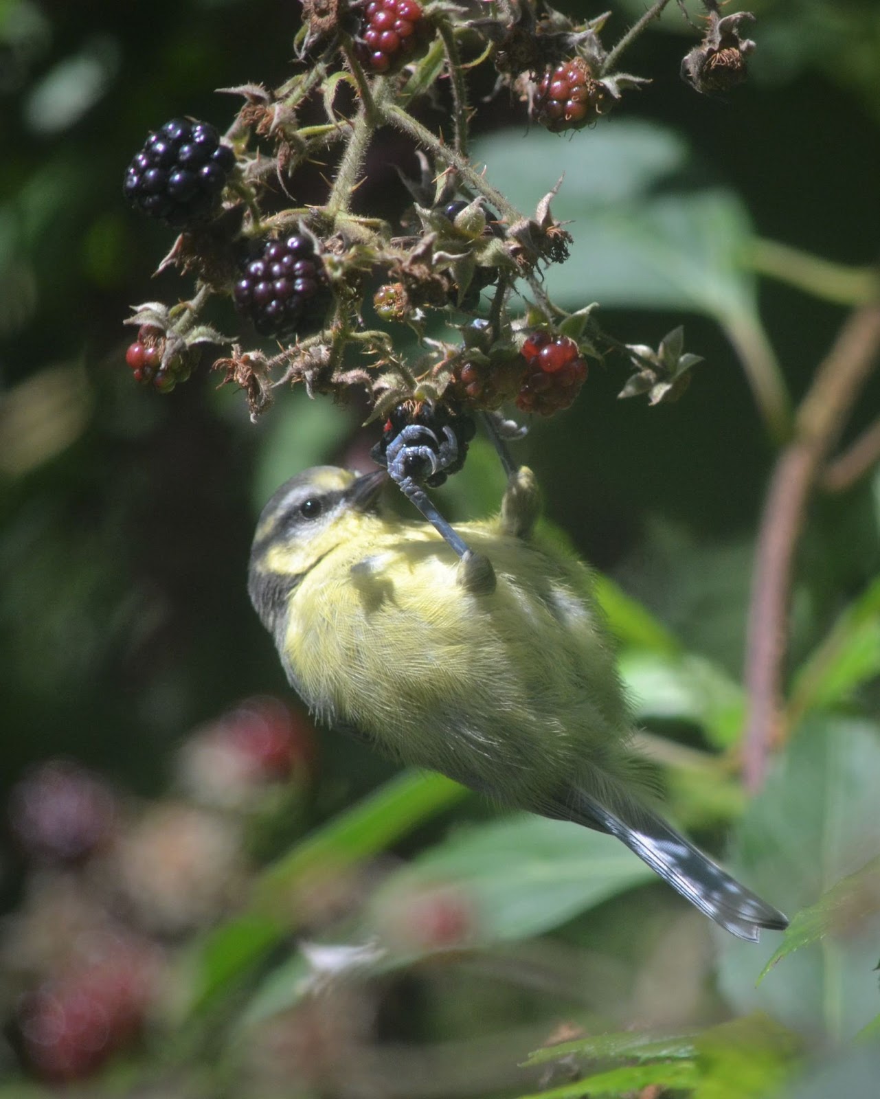
And second, a beautiful image of a juvenile great tit from Chrissie:

What I like:
- Chrissie, you've done a great job of filling the frame with the bird, and I'm loving how I can see all sorts of beautiful little details, like the texture of the feathers and the curl of the feet.
- You've also maintained a nice catchlight in the bird's eye - it's one of those small items that can make a really big difference in all types of bird photography, as it adds interest and gives the bird's eye a sense of three-dimensionality.
- And I really like how you've captured an interesting display of behavior, with the bird hanging upside down on the berries!
What could be improved:
- One thing that I'm noticing is that your lens seems to have focused on the bird's body/leg rather than its head. My recommendation is to always make sure you're focusing on the eye and head, as these are the most important parts of any portrait (whether you're capturing birds, mammals, or people!). In a situation like this, nailing focus on the eye can be tough - unless you're using a camera with Eye AF technology that works on birds, you'll need to change your AF point so it lies over the eye, or make manual focusing adjustments until everything looks sharp. (Another option is to use a narrower aperture, such as f/11, to create a greater window of sharpness - but that comes with other drawbacks, so I generally don't recommend it.)
- I'd also encourage you to explore different angles, or wait until the bird has shifted position, in order to emphasize the head. At present, the head is deemphasized due to the prominence of the leg and lower body. If you were to shoot from off to the left, or if the bird were to rotate its body so its head was closer to the camera, then you could get more of a side profile. (Plus, if the bird's body were more parallel to the camera sensor, you wouldn't have to worry as much about the focusing issue I mentioned above, since the head and body would almost be on the same plane.)
- One other thought: This looks like sunny midday lighting, and as a result, there are a lot of dark shadows and bright highlights (on the berries and the bird, but also in the background). For bird and wildlife photography, I'd recommend avoiding midday photoshoots on sunny days - instead, photograph early or late in the day so you can get that soft golden-hour illumination!
I hope that helps, and once again, thank you to everyone who submitted images!
Talk to you next Saturday,
Jaymes Dempsey (and the dPS team)
ConversionConversion EmoticonEmoticon