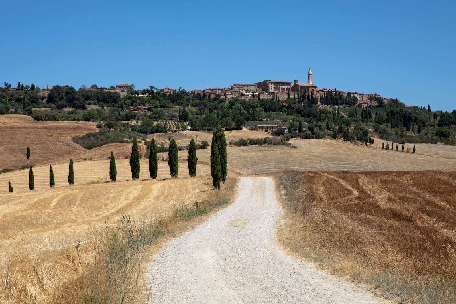
Hi! It's Jaymes again - I hope you're having a great start to March (and if you're in the Northern Hemisphere, perhaps enjoying some warmer weather)! Today, I plan to keep things simple: first, I'll share the dPS bi-weekly challenge, and then I'll share two photo critiques! But before we get into it, I just want to mention our 31 Days promotion for March... Where you can enrol in our foundation photography course "31 Days to Get off Auto" for just $31 (offer ends 31st March). Click here or on the below image to get the offer. And to find out more about the course click here. The dPS bi-weekly challenge: ElectricFrom Sime: 'Electric' is a pretty broad theme, and we're leaving it to you to interpret it as you would like. Make sure you include the hashtags #dPSWeeklyChallenge and #dPSElectric in your post, in the comments of our official weekly challenge page, or over on social media. You can tag us on Facebook, Instagram, or Twitter! And you can also share your image(s) in the dPS Facebook group! More photo critiques!Once again, I have a handful of critiques for you all! And as usual, thanks so much to everyone who sent in images (and for those of you who would like to see your images critiqued, feel free to hit Reply to this message and send along a file or two!). A gorgeous landscape scene from Donna P: 
Things I like: - Donna, first of all, what an amazing scene you've captured, with those beautiful trees, the golden fields, and the buildings up high in the distance. I can certainly understand why you were so drawn to this subject!
- I like the way you've used the gravel path as a leading line, which helps create depth and draw the eye into the distance. I also like your use of layering, which also helps improve the sense of depth - you have a foreground that's low in the frame, a midground, and then, at the top of the frame, a background.
- And I like the simple trichromatic color palette; practically the entire image features shades of green, gold, or blue, which helps unify the scene.
Things to improve: - I'm noticing that the trees in the foreground overlap fairly heavily with some of the elements in the midground (the path, the field edges, and some of the midground objects). If you're looking to create an even stronger sense of three-dimensionality - which is often helpful in landscape photography - I'd encourage you to adjust your framing to create more separation between these elements. The more the eye can clearly separate between the foreground, the midground, and the background, and the more the eye can follow the leading lines (in this case, the path) through the scene, the more 3D the image will appear! In this case, creating that separation while keeping those foreground trees would be tough - you'd likely need to find a higher vantage point, which might not be possible. But you could try moving forward - just to the edge of the hill - to eliminate the trees and photograph the road as it winds down into the valley (with the buildings providing a great background).
- I'd also encourage you to consider the time of day - while there's often not a whole lot of flexibility when you're traveling, I think this scene would look even more stunning at sunrise or sunset! The light would be warm and golden, and you could avoid some of the harsh shadows produced by what looks like midday light. During the so-called golden hours, you could also have more leeway when it comes to the light's direction; I'm imagining the way some side lighting could really emphasize the three-dimensionality of the trees and buildings in the distance (though whether you could find that light from your particular vantage point would depend on the time of year you were shooting). If you could photograph on a day with some cloud cover, the sunrise/sunset could be even more spectacular!
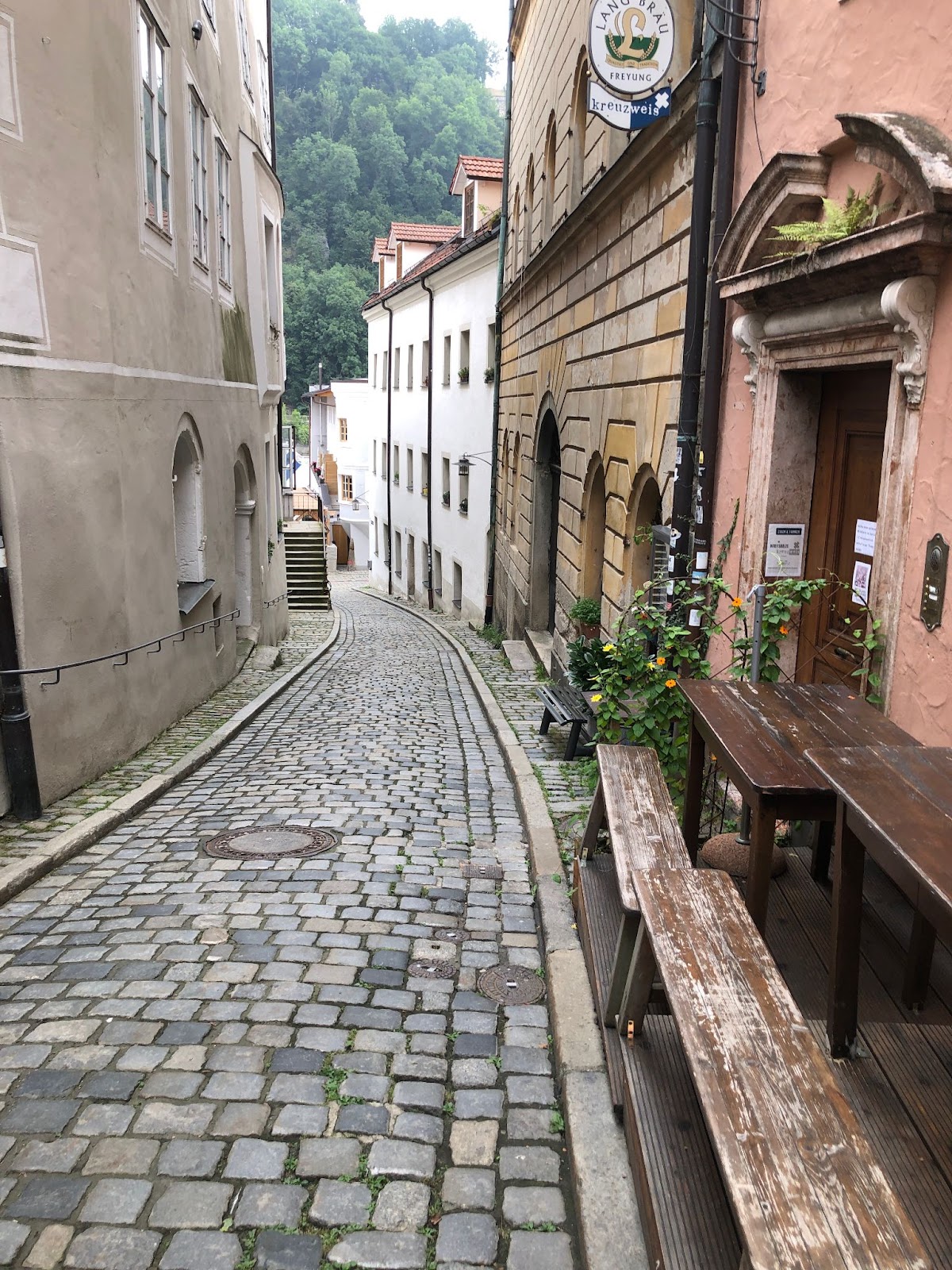
A beautiful street scene from Sally S: 
Things I like: - Sally, I'm a sucker for street scenes like this - while I often consider myself a nature photographer, in recent years I've really delved into this sort of street/architectural photography. And there's a lot to love about this: the leading lines, the beautiful cobblestones, and the interesting conceptual contrast between "culture" in the foreground and "nature" in the background.
- I also like all those little details you've captured in the building facades, in part thanks to your use of a narrower aperture to keep everything nicely sharp!
- Also, if you like this type of image, I highly encourage you to check out the work of Eugene Atget, an early street/architectural photographer who documented Old Paris as it was being reconstructed at the turn of the century.
Things to improve: - One thing that comes to mind - and is often worth checking when photographing buildings, or anything with clear vertical lines, really - is perspective distortion. If you look at the door frames, you'll see that they're bending backward toward the viewer, which happens when you shoot from up close with a wider lens, and you don't keep the lens perfectly level. Here, you've tilted the camera down slightly to emphasize those cobblestones, which has resulted in the vertical building lines converging toward the bottom of the frame. Now, perspective distortion isn't always bad - it can sometimes be a cool effect that adds to the dynamism of a scene - but I generally like to avoid or correct for it when possible. There are a few ways to do that, but the easiest is to use a perspective correction tool when editing (Lightroom, for instance, has a few features to address this, but the "Vertical" button often does the trick!) The only issue is that correcting perspective involves automatic cropping at the edges, as the editing program stretches and compresses the scene. So it can be helpful to deliberately shoot a little wide, knowing that you'll lose pixels along the edges. Another option is to make sure your camera is perfectly level on site, but sometimes you don't want to do that for compositional reasons! (The third option is to use a tilt-shift lens, but those are expensive and there aren't a whole lot of options, so it's not my personal go-to solution.)
- Another item I'm noticing: you have a bit of the sky peeking in, and it draws the eye without adding much to the scene - I'd recommend excluding that sort of isolated burst of sky when possible, even if it means adjusting your composition by moving forward or backward, side to side, up or down, etc.
- One final recommendation with this type of roughly symmetrical scene is to aim for balance between the right and left side of the foreground. Right now, the right side has these beautiful walls and benches, but the left side feels a little empty - the frame doesn't really begin on the left until the viewer has moved a few feet down the right-hand wall. It can be worth experimenting with slightly different camera angles and positioning in order to bring back more of that symmetry and/or balance the scene a bit more!
Well, that's all for today, but like I said, if you have any images you'd like me to create in the coming weeks, do send them along! Talk to you next week! Jaymes Dempsey (and the dPS team) P.S. Remember to take advantage of the 31 Days offer in March. |
| |
ConversionConversion EmoticonEmoticon